
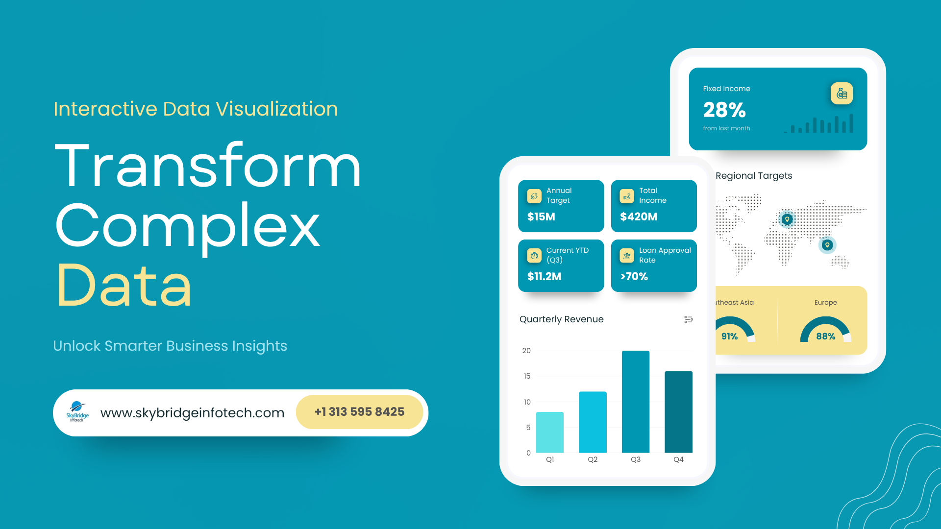
Transform Complex Data with Interactive Data Visualization
Data is everywhere. Businesses collect information from websites, apps, sales platforms, customer interactions, operations, and marketing campaigns every single day. But raw numbers alone rarely help teams make smarter decisions.
The real value comes from understanding what the data is actually saying.
That’s why interactive data visualization has become one of the most important tools for modern businesses. Instead of looking at endless spreadsheets and static reports, companies can now turn complex information into visual dashboards, real-time insights, and easy-to-understand analytics.
With the help of modern data visualization services, organizations can identify trends faster, improve decision-making, and simplify complex business operations.
In this guide, we’ll explore how interactive visualization works, why it matters, and how businesses are using advanced AI analytics for enterprises to transform raw data into actionable insights.
What Is Interactive Data Visualization?
Interactive data visualization is the process of presenting data through visual elements like charts, graphs, dashboards, maps, and reports that users can actively explore and interact with.
Unlike traditional static reports, interactive dashboards allow users to:
- Filter data instantly
- Compare metrics in real time
- Drill down into detailed information
- Track trends visually
- Customize reports based on goals
This makes complex data easier to understand for teams across departments, not just analysts or technical users.
For example, instead of reading through a spreadsheet containing thousands of sales records, a business manager can view an interactive dashboard that instantly highlights:
- Top-performing products
- Revenue trends
- Customer behavior patterns
- Regional sales performance
- Forecasted growth opportunities
This is why businesses increasingly invest in professional data visualization services to improve operational clarity and decision-making.
Why Businesses Need Better Data Visualization
Many organizations already collect huge amounts of information. The problem is that most teams struggle to use it effectively.
Complex datasets often create confusion instead of clarity.
Interactive visualization solves this challenge by turning data into something people can quickly interpret and act on.
Faster Decision-Making
Visual dashboards help teams identify important patterns immediately without manually sorting through reports.
Improved Collaboration
Interactive reports make it easier for departments to align around the same business insights.
Real-Time Monitoring
Companies can track operations, customer activity, and KPIs as changes happen.
Better Forecasting
When paired with advanced AI analytics for enterprises, visualization tools can uncover trends and predict future outcomes more accurately.
Reduced Reporting Complexity
Instead of generating multiple static reports, businesses can centralize data into one interactive platform.
How Interactive Data Visualization Works
Modern visualization systems combine several technologies to simplify data interpretation.
Data Collection
Information is gathered from multiple business systems like CRMs, ERPs, marketing tools, cloud platforms, and databases.
Data Processing
The raw data is cleaned, structured, and organized into usable formats.
Visualization Layer
Charts, dashboards, graphs, heatmaps, and visual reports are created to display key insights clearly.
AI-Driven Analytics
Advanced systems use AI models to identify trends, anomalies, customer patterns, and predictive insights automatically.
User Interaction
Users can filter dashboards, compare metrics, explore reports, and customize views based on business needs.
This combination of business intelligence services and AI-powered analytics helps organizations make more confident decisions faster.
Real Business Applications of Data Visualization
Interactive visualization is no longer limited to analysts. It is now used across nearly every industry.
Sales and Marketing
Businesses visualize campaign performance, customer journeys, lead conversions, and revenue trends in real time.
Finance
Finance teams monitor cash flow, budgeting, forecasting, and risk analysis through dynamic dashboards.
Healthcare
Healthcare providers track patient outcomes, operational efficiency, and resource allocation visually.
Supply Chain Management
Logistics companies use visualization to monitor inventory, shipping delays, warehouse operations, and supplier performance.
SaaS and Technology Companies
Product teams analyze user behavior, feature engagement, churn patterns, and platform performance using interactive analytics.
These use cases highlight why organizations increasingly rely on specialized business intelligence services to manage growing amounts of operational data.
The Role of AI in Modern Data Visualization
Artificial intelligence is changing how businesses interact with data.
Traditional dashboards only display information. AI-powered systems help explain what the data means and what actions businesses should take next.
With advanced AI analytics for enterprises, companies can:
- Detect unusual activity automatically
- Predict customer behavior
- Forecast revenue trends
- Identify operational inefficiencies
- Generate automated insights
- Improve strategic planning
For example, an AI-powered dashboard might automatically alert a retail company that sales are declining in a specific region and identify the likely causes behind the trend.
This proactive approach helps businesses react faster and reduce risk.
Common Challenges Businesses Face
While visualization tools are powerful, implementation often determines success.
Data Silos
Many businesses store information across disconnected systems, making reporting difficult.
Poor Dashboard Design
Too much information can overwhelm users instead of helping them.
Inaccurate Data
Visualization is only effective when the underlying data is clean and reliable.
Limited Scalability
Some systems struggle to handle growing data volumes as organizations expand.
Lack of User Adoption
Complex dashboards can discourage teams from using analytics regularly.
This is why many organizations work with experienced providers offering both data visualization services and business intelligence services to ensure systems are scalable and user-friendly.
Best Practices for Effective Data Visualization
Successful businesses focus on simplicity, usability, and business goals.
Prioritize Clarity
Dashboards should make insights easier to understand, not more complicated.
Focus on Key Metrics
Avoid overcrowding reports with unnecessary information.
Use Real-Time Data
Live dashboards improve responsiveness and decision-making speed.
Design for Different Users
Executives, managers, and analysts often require different views and reporting levels.
Combine AI with Visualization
AI-powered insights help businesses move from reactive reporting to proactive strategy.
Final Thoughts
Data becomes valuable only when people can understand and act on it. Interactive data visualization helps businesses simplify complexity, improve decision-making, and uncover insights that would otherwise remain hidden inside spreadsheets and disconnected systems.
As organizations continue generating larger amounts of information, combining data visualization services with business intelligence services and advanced AI analytics for enterprises will become essential for long-term growth. Businesses that invest in intelligent, user-friendly analytics systems today will be better prepared to compete in an increasingly data-driven future.